
Case study
Three city websites, one .gov
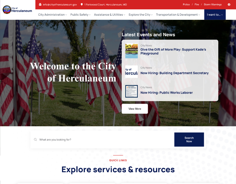
Consolidated a city's main, police, and fire websites into a single mobile-friendly .gov site built around what 4,200+ residents actually need.
UX/UI Designer & Developer
8-month engagement
My role
Led research, IA, visual identity, WordPress build, and the full domain migration.
What changed
Three outdated sites became one accessible .gov site across 80+ pages and 8+ services.
Scope & context
Broken forms, no mobile support, city hall approvals, and a tight municipal budget.
Impact
Easier access to bill pay, permits, and emergency updates — with zero downtime during migration.
Residents couldn't find basic services
Staff copied the same announcements across separate websites. Residents called city hall because contact forms didn't work and essential information was buried. Nothing worked well on mobile.
Designing around real demand
Stakeholder sessions at city hall and Google Analytics showed which services mattered most. I rebuilt the information architecture around three groups: residents, businesses, and city officials.
Permits and contact, rebuilt
High-traffic pages like permits and contact were rebuilt with clear hierarchy, working forms, and mobile-friendly layouts.
Bringing police and fire under one roof
Department sites were folded into the main site with a consistent visual system, so residents get one familiar experience.
Results & lessons
I managed the move to .gov with redirects across all legacy sites — zero downtime and preserved search value — plus a WCAG-compliant brand identity.
Government work taught me that approvals and budgets are design constraints too. Designing for them early kept the project moving.
Next case study
Onboarding that keeps learners