
Case study
Onboarding that keeps learners
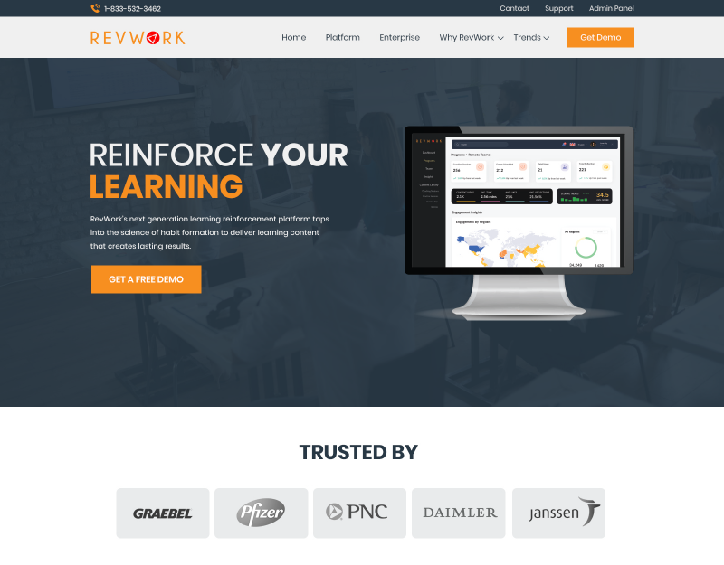
Redesigned a learning platform's website and mobile onboarding to cut drop-off and give the brand a consistent system.
UX/UI Designer
Freelance engagement
My role
Designed landing pages, dashboard UI, and the mobile onboarding flow.
What changed
A modern, accessible design system shared across web and mobile.
Scope & context
Inconsistent visuals and unclear flows led to high drop-off during mobile onboarding.
Outcome
A cohesive experience designed to improve onboarding and retention.
Feature-rich, but hard to start
RevWork's nudge-based learning platform had outdated interfaces and no style guide. First-time users, often new to LMS tools, dropped off during mobile onboarding.
A system before screens
I started with a scalable, accessible design system so every screen and device shared the same foundation.
Onboarding that teaches as it goes
The new mobile onboarding introduces value step by step, so learners understand the platform before being asked to commit.
Results & lessons
Balancing rich features with first-time clarity came down to sequencing: show less up front, reveal more as users succeed.
Next case study
One brand across site and software