
Case study
Optum Rx public experience
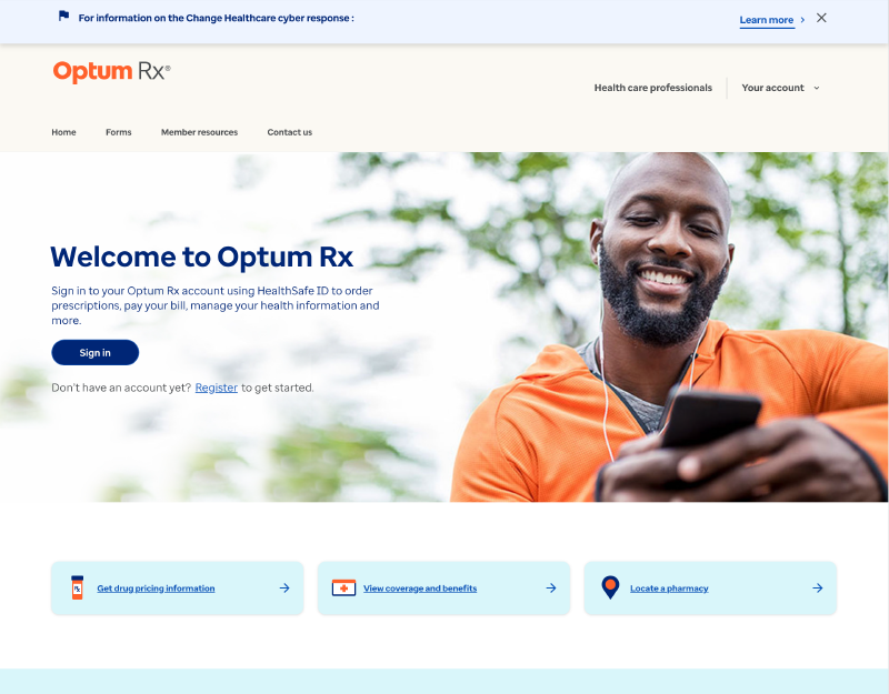
Rebuilt Optum Rx's public web presence to match a refreshed brand and the signed-in member experience, inside a rigid CMS.
Sr. UX/UI Designer
Apr 2023–Dec 2025
My role
Senior designer on the Public Experiences team, covering landing pages, forms, articles, and help content.
What changed
A cohesive public experience aligned with modern brand colors, typography, and content strategy.
Scope & context
Adobe Experience Manager limited us to predefined components, fixed layouts, and strict character counts.
Impact
Better presentation of Optum's features for 28M+ users and 3 Bravo award nominations.
Public pages out of step with the product
Optum Rx's public pages still used old brand guidelines and felt dated next to the signed-in member experience. They had to serve prospective and current members alike, at different points in their healthcare journey.
Auditing what was really there
We combed through every page, confirmed which services were still active, and flagged inconsistencies. The contact page was text-heavy, and article navigation only appeared on some pages.
Learning from the category
We studied CenterWell, Express Scripts, and CVS Caremark: how they split PBM and home-delivery content and handle quick refill, order tracking, sign-in, and help.
- Nearly all led with a welcome hero and one or two signed-out actions
- Sign-in lived in the hero or global navigation
- Help and education patterns varied most — our opportunity
Designing within the constraints
Wireframes set priority content above the fold before high-fidelity design. Working within AEM's fixed components took creative problem-solving to deliver a fresh experience without custom builds.
Results & lessons
Alongside the public redesign, I helped lead a React Native rebuild of the legacy PBM experience for 63M+ members and built a Figma pattern library for WCAG 2.1 AA consistency.
Biggest lesson: information architecture and device height matter. What users understand in the first seconds sets the whole impression. Next, I'd explore a member Q&A forum that feeds a living FAQ.
Next case study
Making investment data scannable